Reports as a Service
Enabling users to effortlessly create detailed reports and distribute them to key stakeholders, streamlining decision-making and enhancing collaboration.
→ Role
Product Designer
→ Platform
Desktop
→ Year
2025


About the product
Actabl is the hospitality industry's only integrated suite of business intelligence, labor management, and hotel operations software. It brings together four industry-leading solutions, including ALICE, to maximize hotel profitability. Serving over 12,000 properties globally, Actabl empowers hoteliers with actionable insights and seamless tools for efficiency and guest satisfaction.
High Level Business and User Goals
Establish a long-term UX vision for reporting across the platform.
Reduce dependency on support and engineering through self-service tools, as well as empower users to create and share reports without technical help.
Capture new revenue opportunities through scalable reporting features
With this redesign, we projected a $250K+ annual impact by reducing support overhead and unlocking upsell potential for advanced reporting.
Team
Director of Product Design: Guilherme Lencin
My Role
As a Senior Product Designer on the ALICE team, I led the redesign of the Reports feature, a critical component for department heads and executives to gain operational insights. While the broader design team contributed to strategy and discovery across the Actabl ecosystem, I was directly responsible for the end-to-end UX improvement of the Reports experience, from research to concept to design validation.
Our Design Approach & Vision
As a design team, we craft our product and design strategy through continuous discovery. We track user sentiment via NPS, Pendo, and extensive research (quantitative and qualitative), advocating for seamless, valuable, and intuitive experiences beyond just UI..
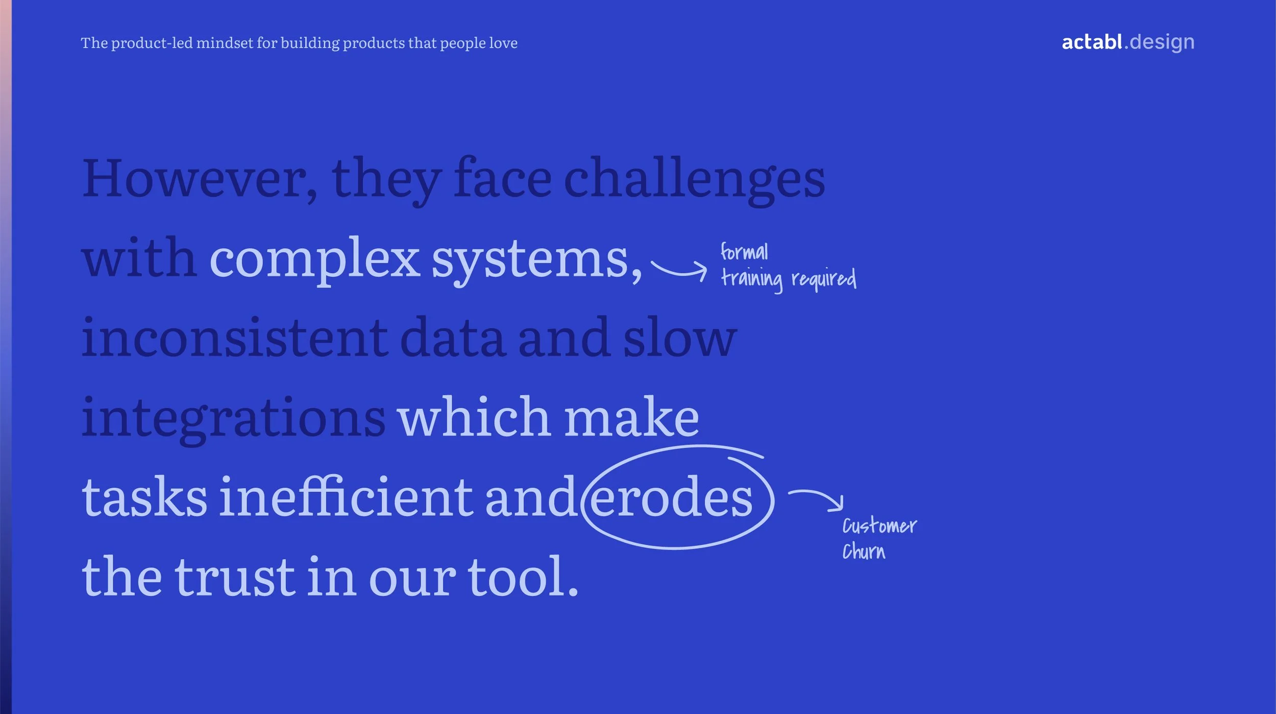
We developed a bold design vision, allowing creative freedom to prototype solutions for key user pain points: limited training time, manual work frustration, and lack of platform trust due to poor UX.
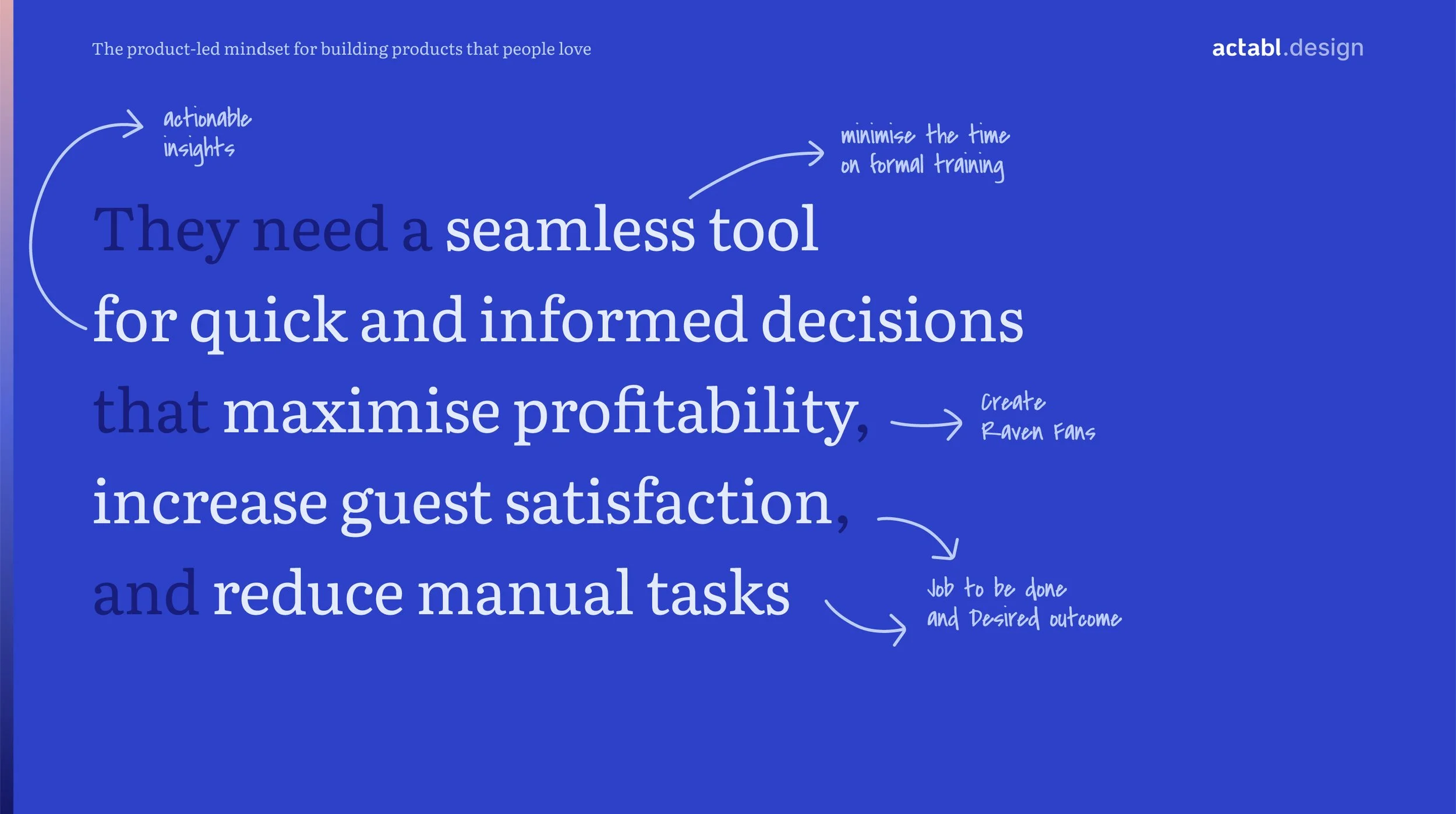
This fueled our vision for an intuitive, insightful, and delightful platform that empowers confident decision-making. To ensure relevance, we defined comprehensive user personas across hotel leadership and departments.
Presentation on the Design Team Vision
Reports: Identifying the Opportunity
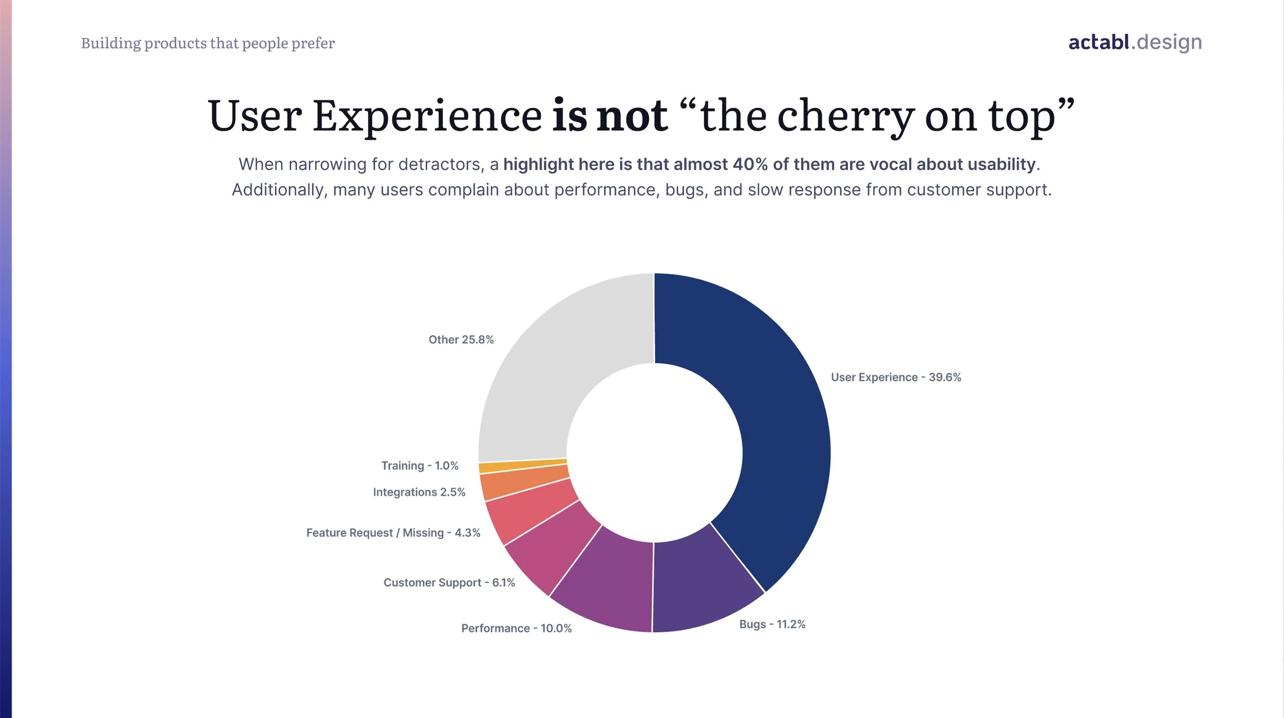
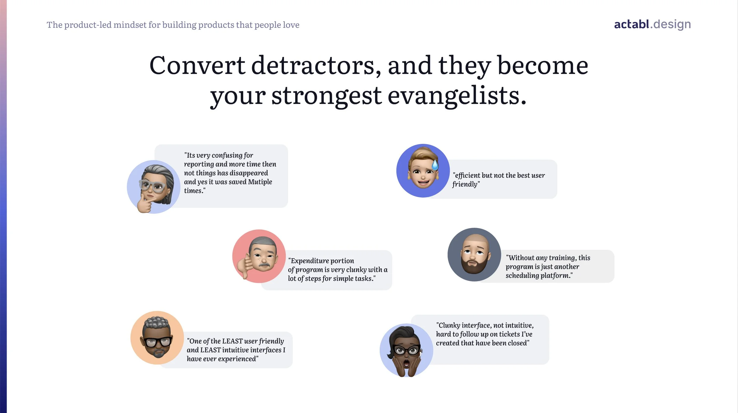
The existing Reports experience is outdated, cumbersome, and reactive. Most hotels rely on default or manually requested custom reports, involving multiple steps between customer support and engineering.
This process:
Is slow and inflexible
Doesn't allow users to self-serve
Creates a bottleneck for scaling report needs
Deliver a subpar experience to users with high expectations
We saw an opportunity to move from static, default output to “Reports as a Service”: a robust, flexible solution allowing users to create, customize, and share reports on their own terms.
Before vs After


Before vs After


Before:
Outdated UI, non-intuitive interactions, and limited layout options.
Users couldn’t create their own reports. All customizations required support.
After:
A redesigned homepage with recently viewed reports and all available reports.
Users can now create, view, and manage reports (including those shared with them) directly from the Reports menu.
A new report builder with drag-and-drop widgets, chart customization, and templated reports tailored to user roles.
Actions like duplicating, deleting, and reordering reports are now easy and accessible.
Ability to save, export as PDF, print, or share with the team.

Screen Flow
Advanced Features:
Pre-built templates based on role-specific needs.
Shareable reports with permission control.
Print and export options for above-property or ownership groups.
Built-in analytics widgets designed with hotel KPIs in mind.
Design Outcome
Even the best vision falls flat without execution. Our guiding principle: ideas are nothing without action.
Inspired by Virgil Abloh’s 3% approach, we focused on small but impactful changes that drive meaningful improvements.
This philosophy helps us deliver consistent enhancements that build momentum across teams and make our product more marketable and preferred. With each iteration, we elevate not just the look, but the usability and strategic value of the product.
Challenges & Learnings
Balancing long-term vision with the need for quick wins.
Aligning technical feasibility with experience goals.
Getting stakeholder buy-in for an investment in foundational UX work.
Advocating for continuous iteration over one-off redesigns.
Future Steps
As we begin rolling out the reimagined reporting tool, we’ll gather feedback at each milestone. But lasting impact requires cross-team buy-in, mostly across C-Level, product, and engineering. When everyone sees how their work solves real customer problems, we move faster and build better.
We call this mindset the 3% mindset:
A little better every time.
A little more delightful.
A little more valuable.
And ultimately, a lot more trusted.